Thursday, May 25, 2017
End of year reflection 2017
I learned many things this year. I learned how to use the adobe programs more effectively and how to use cell animation to make a good looking animation. i was able to use rigging in maya and make a working skeleton for a fish. i was able to see that if you are working in a group and you cannot spend enough time with your group or your group does not work well with each other you and your group will not be able to make progress and your work will not be good. i have also learned that if you do not know what words you should use or how you can talk to someone you will miscommunicate and some information will be lost or because of how it was delivered. i had my school hours split an that resulted in me needing to develop better management for my projects so i was able to split my work and determine what i would be able to do and when. I was able to help my group when they hit a slump in our work and even help them out with some of the programs on the more technical side. i still have a slow drive but i am getting more efficient at work and have a good motivation and thirst for knowledge. i need to work on getting into a project and when i work i need to not get sidetracked so that i can continue with good progress. i hope to be able to get a job in this field in the future and maybe do some freelance.

Monday, May 22, 2017
the plausible impossible
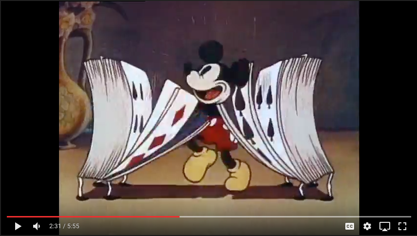

 In class we watched a old film made by Disney that explained how they animate some there films and episodes and how they make some of the actions that their characters do like running on air and jumping through a mirror. in the short clip that i pulled some screen shots from Mickey mouse jumped in to a mirror and came out on the other side in a place were everything is opposite. the furniture and appliances and toys were alive and moved and had emotions. in real life this is impossible but through there animations they are able to make it appear possible and real. when mickey is skipping rope with a telephone he is also making a beat with is shoes and when the radio hears it the radio tunes itself to a song and it starts to dance and snap its fingers. the film also has Mickey fighting a deck of cards because he was dancing with the queen and the king saw them and started to sword fight. the king pulls his sword from his card and Mickey used a needle to fight him. after he looses the king calls his whole card army to fight Mickey and chase him back through the mirror.

Tuesday, December 20, 2016
Gladstone
http://www.animationarena.com/becoming-an-animator.html
The article i chose was wrote by Annie gray. It talks about the different stages of creative thinking. Being creative and expressing your creativity starts to get more complicated when you
The article i chose was wrote by Annie gray. It talks about the different stages of creative thinking. Being creative and expressing your creativity starts to get more complicated when you
Wednesday, November 30, 2016
Quarter 2 Project
Thursday, October 13, 2016
Quarter 1 progress
 |
| source picture |
 |
| current progress |
Wednesday, May 18, 2016
Animation Reflection
What I Learned
I learned a lot about 2D and 3D animation and modeling. I learned vfx and green screen and editing in after effects. I learned how to use photoshop and Illustrator and maya. Mr.Netterville taught us most if not all of what I learned. We used one tutorial for the beginning of maya, and after that he taught us everything else.
Mr.Netterville
His teaching style is great the classroom feels fun and doesn't have a heavy atmosphere and is still slightly serious. The only comment I have is to improve productivity of the students. Sometimes he would take a whole class period and we would not have time to work. This might be do to the fact that i had lunch in the same hour as his class, but I don't know.
My Views On This Class
It is important to know the basics of the programs so that you can improve and learn new advanced techniques. I am really good with maya and with some of the effects in after effects. I could improve on my photoshop skills and make my final products even greater. I have already started to improve on my final products and will try to improve on photoshop if i can get the programs over summer.
My Future Plans
I will continue to develop my skills in a way that will set me up for success in the future. I will make a great entry for emagine next year and will win. I would like to have focused more on photoshop and the basics of that and i would have enrolled in web design instead of graphic design. In conclusion this year was very productive and i was very pleased with what i learned and how mr.netterville taught us.
Tuesday, May 17, 2016
End of year reflection
I learned how to use adobe illustrator throughout the year and learned some basics of adobe photoshop. I learned how to use the pen tool through a tutorial that mrs.lofquist provided us a link for and in my free time i learned how to use the perspective grid to make 3-D looking pictures. Mrs.lofquist gave us guides for photoshop and we learned how to use clipping masks and what the limits of the program are. I am really good with illustrator and know how to make 3-D objects using it and know how to apply colors and textures to it. I am not satisfied with my current knowledge of photoshop and wish to strengthen it more. I am strong with assessing others skills and can take lead of a group and help them become stronger by guiding them in the right direction. I am weak in motivation and the drive to accomplish work but i have been improving that and will try to improve it even more. I am going to pursue a future career in animation and will try to get a bachelor degree for animation also. If i could change what i would have done i would have put more effort towards the final product and not of worried on the details so much. In conclusion i would say that i learned a lot in this year and that
Friday, May 13, 2016
Flash Intro

The You in Youtube
this article talks about the future of small time animators and freelance animators and designers on youtube. if the small time animators stay independent and do not partner with companies the will not get as many views and they will be more vulnerable to copyright strikes and attacks on their channel, but all hope is not lost. although the alternatives are harder they are still alternatives. for a self employed animator using youtube as their outlet they will have make, pitch, and sell their creations to their fans and hope to get ad-revinue all while battling copyright and plagiarism.
this author seems to have done his research on youtube and can write with a good flow. his sentences art choppy and there isn't any awkward pause in his blog. he talks about how youtube is more about pointing viewers towards high ad potential channels and because there is just so much content being made now that the limit to what is being watched is not by the channel or a TV schedule it is made by the viewer. one of his weaknesses is that he docent get to the point of the article very fast he is two to three paragraphs in before he tells you what he is arguing for.
http://animationanomaly.com/2016/02/16/independent-animators-more-tough-choices-ahead/
this author seems to have done his research on youtube and can write with a good flow. his sentences art choppy and there isn't any awkward pause in his blog. he talks about how youtube is more about pointing viewers towards high ad potential channels and because there is just so much content being made now that the limit to what is being watched is not by the channel or a TV schedule it is made by the viewer. one of his weaknesses is that he docent get to the point of the article very fast he is two to three paragraphs in before he tells you what he is arguing for.
http://animationanomaly.com/2016/02/16/independent-animators-more-tough-choices-ahead/
Thursday, May 12, 2016
eMagine
I was not able to go to imagine because of a band trip but i think that there was a problem with plagiarism and i think that some of the winners shouldn't of won.
3-D in Adobe Illustrator

Wednesday, May 11, 2016
carton

Me and my partner Ben had to make a carton based around a product. we made a carton for snake oil and used the 3-D effect in illustrator to put it all together. i made the snake logo with the pen tool and we found a free for use font to go with our box. Ben helped with the image and the 3-D boxes.
Movie Poster

Magazine

Thursday, December 10, 2015
logo

My Logo
My logo is very simplistic and has a professional and organized look. i wanted to make my logo with out over doing details so that it would appear good on a letter head or on a building or sign. only using one color eliminates cost of printing with multiple colors and can be changed with out a problem. it is very simple and could easily be recreated.
The steps to make my logo
1. the box
first you take a box and the color dose not matter because a later step changes it anyway. the size should be big compared to the text. |
| 1 |
 |
| 2 |
 |
| 2 |
 |
| 2 |
2. get text
i used my name for this and i went through all the text to find a better text that has straight lines but still has serifs. |
| 3 |
3. position the text
i positioned the text in front of the box and changed the color of the text so that it is easier to see.
4. pathfinder
 |
| 4 |
 |
| 4 |
now that you have positioned the text and the box make the text a object by creating outlines than select both the text and the box and use the difference tool to pop the text out of the box and make some empty space were the text used to be.
5. potential purposes
this is a simple logo and could easily be recolored or be textured and would look good almost any were and you could combine any text with any shape. |
| 5 |
Wednesday, December 9, 2015
Photoshop painting
Painting
 I learned that you can use different brush presets in Photoshop and blend colors and pictures to make a painting look-alike of the image. i used a mix of wet and not wet brushes to blend and make some colors stand out from the picture. i chose Yosemite because that is the background picture for every mac in the e-communication classroom.
My first Photoshop tutorial
Sky Mountain
I used Photoshop and a tutorial from the internet to make a mountain look like it is floating in a dark sky. i put a moon in the top left and all of the images are de-fringed to look smoother and i used high res pictures for every thing. i put a shadow on a cloud that i moved to the front of the mountain to hide the bottom so it wouldn't look bad and darkened everything to look more mystical. i downloaded text and used a serif text and a sanserif text to contrast each other to draw the viewers attention.

Postcards
Postcards And Photoshop

 I used Photoshop to take images and use clipping masks and text to make some holiday postcards. i used a tree on the right and snow for the text. and i used snow for the back on the left and used Christmas colors for the text.
professional article review
Belly Busting Content
the article i read was focused on comparing the restaurant business world to the animation business world. in truth they are similar in many ways and the blogger points these things out with many different comparisons.
he says that in the world of restaurants
The Post
Bottles

My 3-D bottles
I had used illustrator to make a line which we would than make a 3-D image of and move it around in a three dimensional space and put a cork in the top. i later went back in and messed around with the colors and other tools to get a glass look. i also made a name tag like symbol and than put it on the bottle so that it would movie with the bottle as it moved in the 3-D space.
Subscribe to:
Posts (Atom)